Components: the blocks every consulting deck is built from
A three-column comparison, a 2x2, an insight panel down the right side, a KPI row, a CAGR arrow over the bars. The same blocks appear in every deck and get rebuilt by hand every time. Decky AI now generates them straight into your slide, in your template's own type and colours, as native PowerPoint shapes you can still edit.
You are on the options page. Three columns, a small label above each heading, a hairline between them, a rule under the headings, three bullets in each column. You know exactly what it looks like because you have built it a hundred times.
So you build it again. A text box, then another, then four more. You copy one across and the spacing drifts by a millimetre. Twenty minutes later you have the page you already had in your head before you opened the file.
Every consulting deck is built from the same small set of blocks
Look at a hundred client pages and the vocabulary is remarkably small. There is the columned comparison. There is the 2x2 with the items plotted on it. There is the panel of key messages running down the right side of a chart, which is where the “so what” always goes. There is the row of headline numbers, one of them with a delta next to it. There is the small table of the figures behind the exhibit. There is the arrow across the tops of the bars with the growth rate in a pill at its midpoint. There is the quote from an interview, the stripe that says Preliminary, the wheel of steps in the operating model.
That is not a lack of imagination. It is a shared visual language, and it is the reason a partner can read a page in four seconds. The forms are conventional on purpose. What varies between decks is the argument, not the furniture.
Which makes it strange that the furniture is rebuilt from scratch every single time.
Why your template does not help with this
A template gives you masters, layouts, a colour scheme and two typefaces. It does not give you the
arrangement. Nothing in a .potx knows what a two by two is.
So the blocks live somewhere else, which is to say they live in the last deck that had one. You open a project from March, find the page, copy the group, paste it into the deck you are working on now, and then spend ten minutes undoing what came with it: the old client’s blue, a font that is not your font, a text size set for a 12pt master when this one is 11pt. Half the time it is faster to redraw it, which is what you end up doing.
Generated rather than pasted
The Assets tab in Decky now has a Components section, alongside the maps, flags and icons that were already there. It covers the column table, the category grid, the insight panel, the metric call-out, the data table, the heatmap, the waffle chart, the 2x2 matrix, the quote, the call-out with a leader line, the annotation arrow, the badge and the segment ring, and it is still growing.
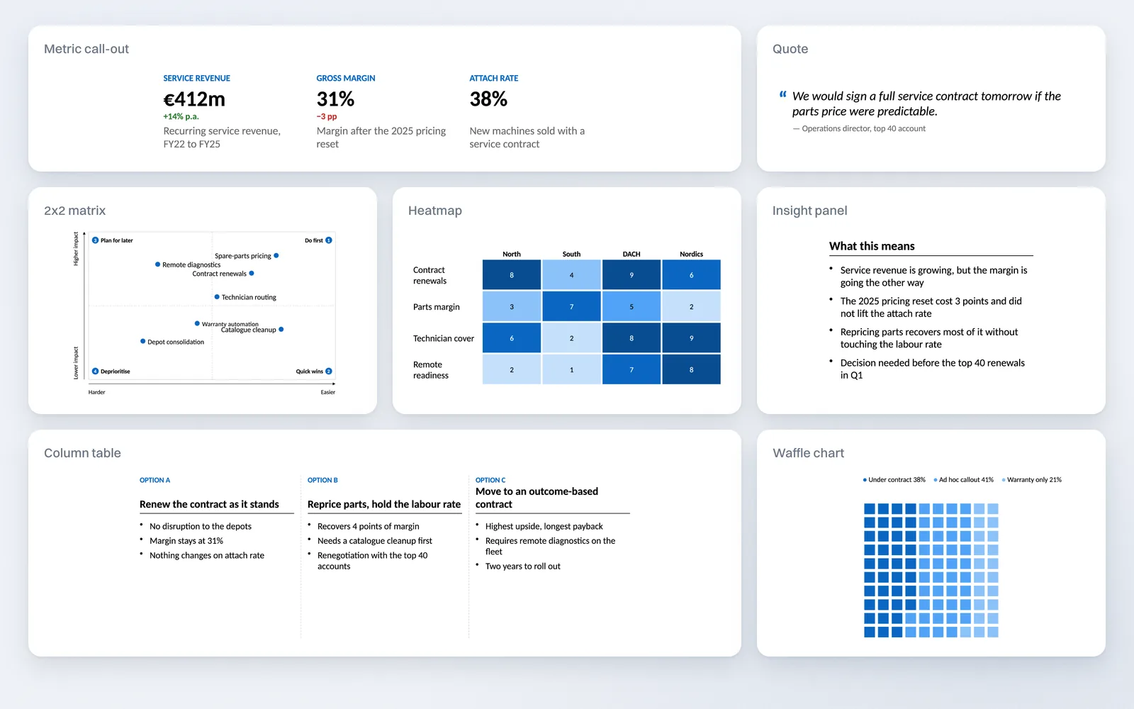
Illustrative example, not client data.
The important word is generated. A component is not a stored picture that gets stretched to fit. It is a recipe that runs at the moment you place it, against the slide you are placing it on. It reads the type sizes out of your slide master, so on an 11pt master you get an 11pt component. Every colour it writes is a theme token rather than a hex value, and every run of text points at the theme’s own major and minor fonts, so the block comes out in the deck’s typefaces and palette without anyone having to recolour anything afterwards.
The exceptions are the two or three places where a colour carries meaning rather than style. A
signed delta on a metric shows green when it is positive and red when it is negative, because a
consultant reading +14% p.a. and -3 pp should not have to read the sign.
The hairlines and the muted captions are not a grey at all: they are your own text colour at low opacity. That reads as a soft grey on a white master and a soft grey the other way on a dark one, and it keeps working when the darkness comes from a photograph on the layout.
What lands on the slide is shapes, not a picture
A placed component is a group of ordinary PowerPoint shapes. Every part has a name, so the heading of the second column is a thing you can point at: change it by asking Decky, or click into it and type, like any other text box.
The arity is real too. Two items make a two-column table and five make a five-column one, rather than a five-column graphic with two columns hidden. And a box too small for the content is refused with the minimum size named, rather than the type being quietly shrunk to fit.
There are two ways to place one. Ask, and Decky builds it into the page as it goes: “put the three options side by side with the margin impact under each” gets a column table with your content in it, not a placeholder. Or open the Assets tab, choose Components, and click one. It lands on whatever you have selected, or in the middle of the slide if you have nothing selected, and then it is yours.
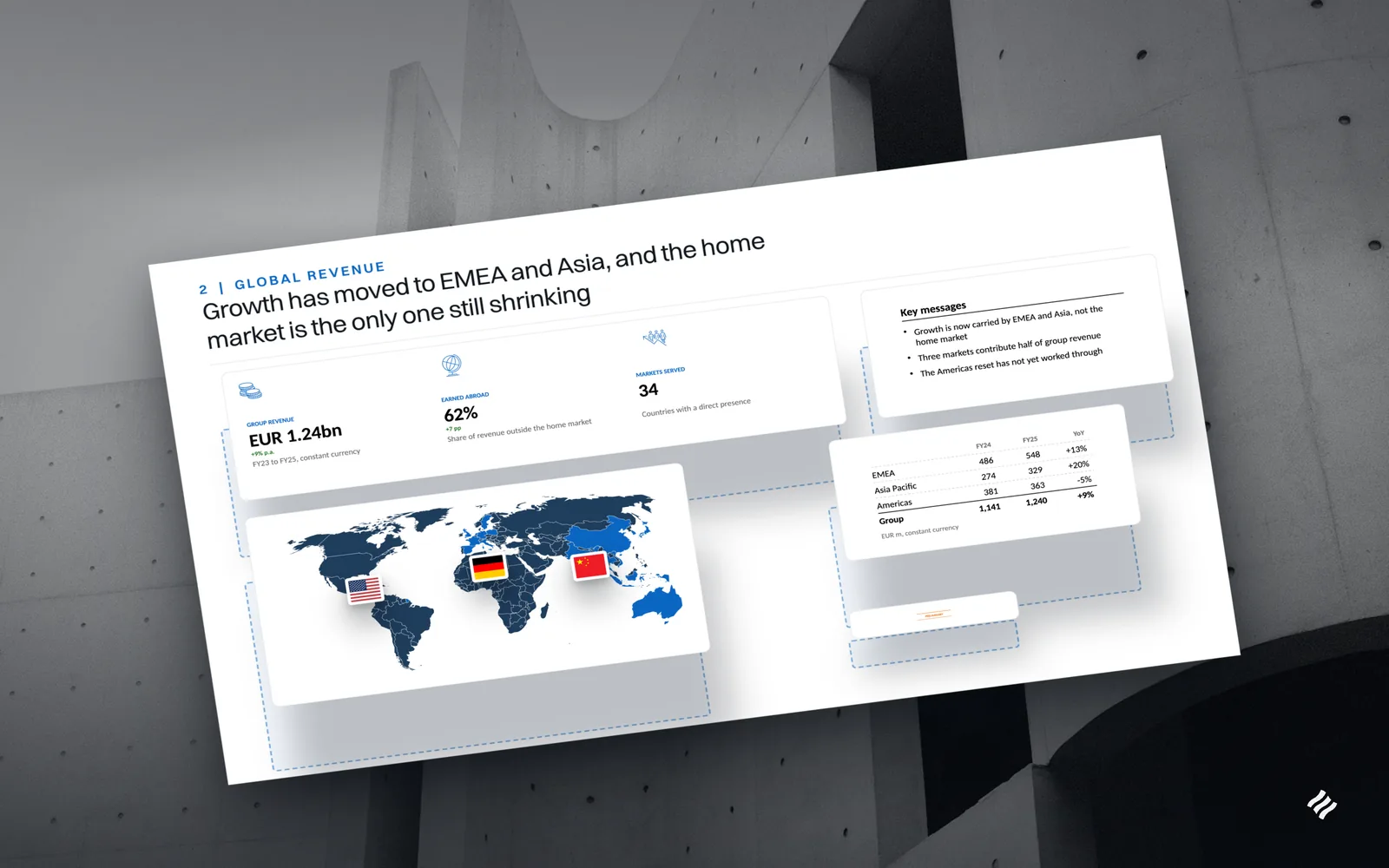
Most pages want more than one of them, and more than one shelf. The page at the top of this article is a figure band, a key messages panel and a data table from Components, the world map from Maps, three flags pinned on it as markers, and an icon over each figure. Every country on that map is its own shape, so the growth markets could be picked out one at a time. All of it came off the same shelves, and all of it took the deck’s palette on the way in.
The blocks were always in your head. Now they are in the panel, and they arrive speaking your deck’s language rather than the last one’s.
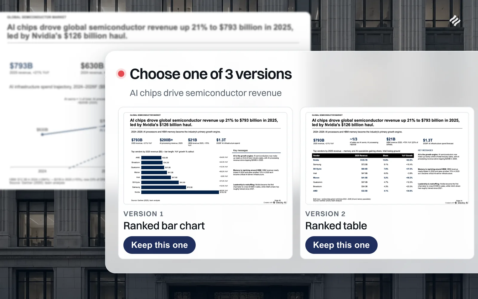
If you want the same idea applied to whole pages rather than blocks, the Slide Library saves and re-uses slides you have already built, and Versions builds two or three takes of the same page so you can pick the form that fits.

Maximilian Nitsche · Founder, Decky AI
I built Decky AI so anyone can put an MBB-level slide together and still be done before 8pm. I write here about the craft of consulting decks, and about what we ship.