Three ways a picture becomes a slide: your sketch, the whiteboard, a layout you liked
A drawing, a photographed whiteboard, a layout you saw somewhere and want to build like. All three are the same move: attach the picture, and the arrangement is rebuilt as a slide with native charts, an action title that stays a sentence, and your own template doing the styling.
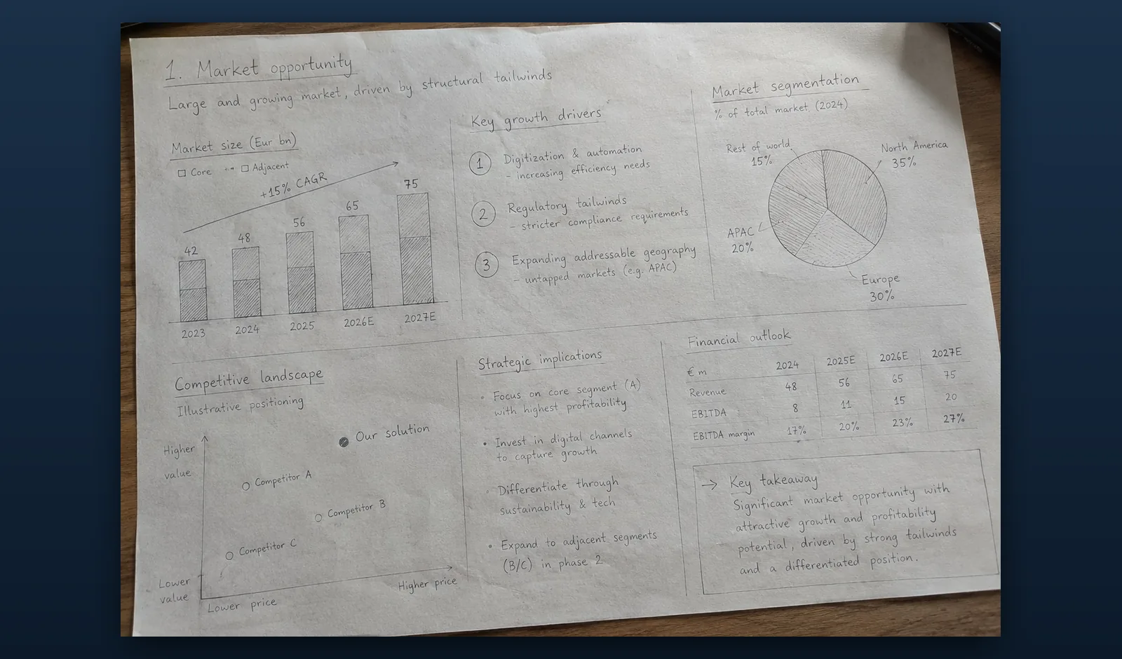
The page already exists. You drew it in a notebook on the train, or on the back of the agenda while somebody else was presenting. Six panels, a stacked bar with an arrow over it, a two by two, a boxed takeaway in the corner, an action title across the top. Everyone in the room understood it.
Then you open PowerPoint, and none of that is done.
Why consultants draw the page before they build it
Drawing is faster than building because paper does not force decisions in the wrong order. In PowerPoint every gesture asks a formatting question before the argument has settled: what size is this text box, does that shape snap to the guide, is this chart the right type. Paper asks none of them.
So a sketch is the closest thing a consulting page has to a specification. The grid is decided, the reading order is decided, what is a chart and what is a table is decided, and a panel that takes half the page is making a claim about what matters. The drawing is not a rough idea. It is finished thinking, in a format nobody can present.
The expensive part is the transcription
What costs the evening is not the thinking. It is transcription. Aligning panels on a grid that is not quite the grid you drew, building a stacked bar and then a growth callout over the top of it, matching a table header to the master, then noticing the panel titles came out at three different sizes.
None of that is judgement. It is craft you already demonstrated once, on paper.
Describing the layout in words instead sounds efficient until you try it. By the time the description is precise enough to be useful, drawing it would have been quicker. A drawing is a lossless brief. A paragraph describing a drawing is not.
Three pictures that all do the same job
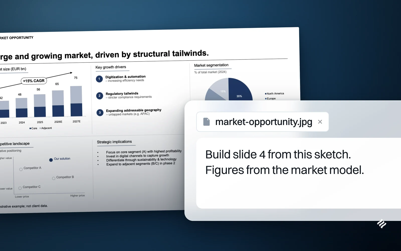
Take a picture, drop it into the chat in PowerPoint, and the model works from the image itself rather than from a written account of it. It exists because consultants photograph things, not as a general upload that happens to accept pictures.
Three of those pictures come up constantly, and they are the same move.
The page you drew. A notebook page, a sheet of A4, the back of a printed agenda. You already settled the grid and the reading order, and the drawing carries both.
The whiteboard at the end of a workshop. The wall after a client session is the most expensive artefact of the day and the one most likely to be lost. Photographing it is already what everyone does. What changes is that the photograph becomes the input to the page instead of the folder nobody opens.
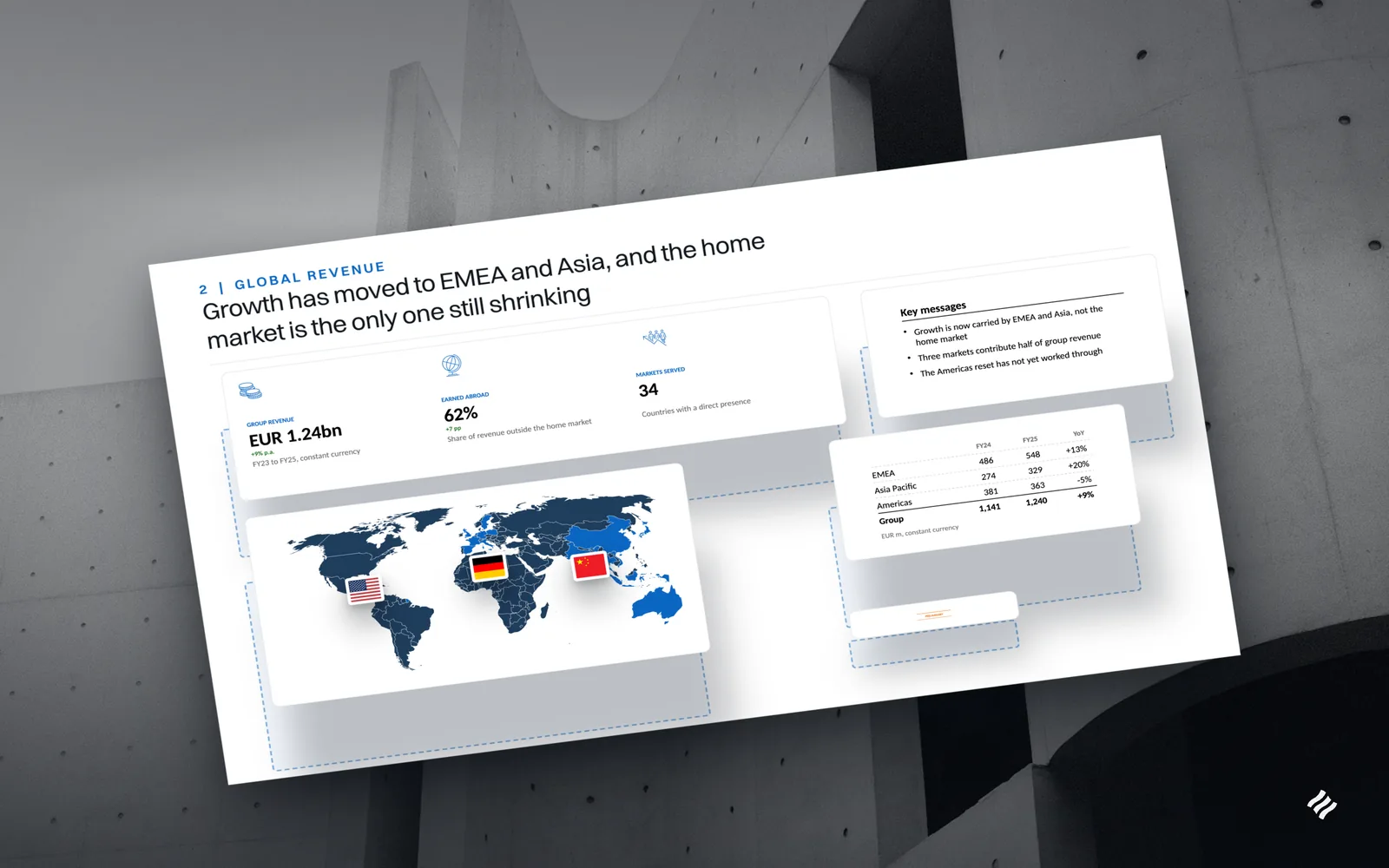
A layout you saw and want to build like. A page in an annual report, an exhibit in a deck someone shared, a chart arrangement you cannot name but could point at. Screenshot it and say what you want taken from it, because the answer differs.
A picture can be used in one of three ways:
- As a layout. The arrangement is rebuilt on the slide and the picture itself is never placed on it. This covers the sketch and the whiteboard, and it is the default.
- As content. The picture goes onto the slide, for a screenshot or a photograph you actually want in the deck.
- As a style. The look and feel only. It deliberately does not copy the content or the layout, which is the right behaviour when you admire how a page is set rather than how it is organised.
That distinction matters most for the third case. Point at someone else’s exhibit as a layout and you get the arrangement, rebuilt from your own material, because a layout reference is never embedded and never supplies the words. You borrow the shape of an argument, not the page. It is the division of labour of handing a sketch to an analyst: this is the page, here are the figures, the drafting is yours.
What survives the translation
This is where a tool either understood the page or merely borrowed its theme. Drag the handle to see it: on the left the page as it was drawn, on the right the page Decky built from it.
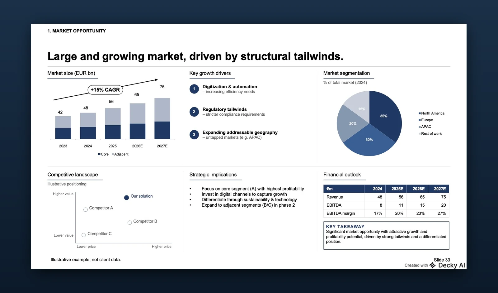
Illustrative example, not client data.
The layout survives. Panels sit where they were drawn, in the same grid, in the same reading order. The sketch is a plan, not a mood board.
The charts are charts. A stacked bar drawn by hand comes out as a native PowerPoint chart with a real worksheet embedded behind it, not a picture of one. The number that changes at 11pm can still be changed.
The action title survives as a sentence. A title written across the top of a sketch stays the headline it was, rather than being flattened into a topic label like “Market overview”.
Annotations become slide furniture. The growth arrow scrawled over the bars becomes a callout, and the box you drew around the takeaway becomes a key takeaway panel.
The template applies itself. Type hierarchy, the palette, the rules under panel titles, the table header: all of it comes from the deck’s own master. The sketch supplies the structure, the master supplies the look.
The thinking stays yours
There is an honest limit to this, and it is the best thing about it. A photograph of a sketch only works because someone already knew what the page should be. The tool does not decide the argument, choose the framework, or work out what belongs on the page. It cannot, and you would not want it to. That judgement is the job.
What it removes is the transcription that follows the judgement, the part that was never consulting in the first place. The sketch you would have thrown away becomes the thing that builds the slide.
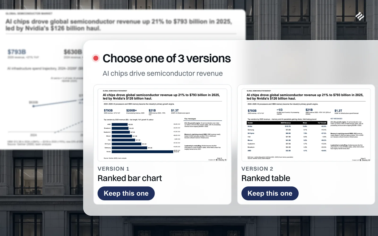
When the sketch itself is undecided, when you drew the page three ways and are not sure which one carries the point, that is what Versions is for: the same content built as two or three different exhibits, side by side, so you choose by looking rather than by arguing.
It is the same test the consultants who use it hold: a page that survives the review, in the right template, still editable when the numbers move. Once it exists, it is worth keeping it so the next engagement starts from it.
Draw the page you were going to draw anyway, or photograph the wall before somebody wipes it. Then try it against your own template, or book a walkthrough and bring a sketch.

Maximilian Nitsche · Founder, Decky AI
I built Decky AI so anyone can put an MBB-level slide together and still be done before 8pm. I write here about the craft of consulting decks, and about what we ship.